
10 Common Webflow Problems and How to Fix Them
Key takeaways
- Webflow is a powerful low-code platform, but it comes with challenges that users need to manage to get the best results.
- Common issues include slow Designer performance, uncompressed media files, poor image and video optimization, and unclear class naming.
- Using div block grids instead of columns, setting padding on parent elements, and properly adding anchor links can improve site structure and responsiveness.
- Webflow lacks detailed edit history and clear collaboration tracking, so teams should manually save versions and use Workspaces and Page Branching to stay organized.
- Designers should also ensure menus and layouts are responsive on tablets and smaller screens to avoid usability problems.
- Despite these challenges, Webflow’s design freedom, responsive features, and built-in SEO tools make it one of the best platforms for building high-quality, professional websites.
Thanks to its amazing service, Webflow remains one of the fastest-growing online website solutions. The platform’s revolutionary low-code/no-code approach made it appealing to many designers, developers, and marketers alike.
But it’s not perfect.
It’s important to understand how to avoid possible pitfalls to get the most out of it. Therefore, I decided to address some of the problems many users encounter when using Webflow and provide quick fixes for each.
Without further ado, let’s explore them.
{{cta}}
1. Troubleshooting Issues

As a designer or developer, you’ll likely spend most of your time using Webflow Designer. Sometimes, you might encounter problems, such as slower functionality or a complete standstill.
In that case, it’s time to troubleshoot this and find out the source of the issue. Here’s how.
- Check your internet connection — Check if you’re connected to the web, and if you are, use tools such as Speed Test to see whether your connection is strong enough.
- See if you’re using the latest version of compatible browsers — Webflow works best with the up-to-date versions of Google Chrome or Safari, so make sure to check which version you have via whatsmybrowser.org.
- Remove unnecessary browser extensions — Some extensions (such as Grammarly or Adblockers) are heavy on the RAM and can slow down your entire computer. That may also be the case why your Webflow Designer is lagging. See how each extension burdens your browser, and remove the heavy ones.
- Remove unused styles — Visit the style managers and see if there are any styles left behind that you’re not using. These may cause your Designer to become a bit slower.
- Optimize on-site content — If your images take a lot of time to load, you’ll need to optimize them before adding them to your Designer to speed it further up.
Finally, another Designer issue you might encounter is that the published site looks different compared to what you see in Designer. In that case, try republishing the site, clear your browser cache, and try again.
2. Forgetting to Compress Media Files Before Inserting

Webflow automatically sizes and scales your image depending on the device you use to access your site. However, you should also try to compress any media you want to put on your site before actually uploading it.
Use tools such as TinyPNG to compress your images and ensure your videos do not take up too much space.
This is a simple solution to something that could become a huge problem if you’re not careful from the start. We’ve seen clients report terrible results before coming to us simply because their content-heavy sites all featured plenty of items to load. This results in terrible bounce rates and, ultimately, affects your SEO.
3. Not Optimizing Your Images and Videos

Webflow is an SEO-oriented builder that allowing you to optimize your site and make it human quickly- and search-engine-friendly. One of the things that many overlook is optimizing videos and images for search engines. All of that can be quickly done with Webflow Designer and Webflow Editor. Here’s what you need to know.
For optimizing images, follow these steps:
- Select the right format — JPEG for photos, PNG for transparency, balancing quality and size.
- Compress images — Maintain quality while reducing file size to enhance loading speed (a crucial ranking factor).
- Use descriptive file names — Add relevant keywords, not generic names like "image001.jpg" for better search engine understanding.
- Include alt text — Each image needs descriptive, keyword-rich alt text to aid search engines and visually impaired users.
- Responsive images — Optimize for various devices, ensuring faster load times and an improved user experience (Webflow takes care of this for you).
To optimize videos for SEO, adhere to these guidelines:
- Select the appropriate hosting platform — YouTube, the second-largest search engine, is ideal for uploading videos and embedding them on your website. However, Vimeo gives you more options for embedding, and it’s another option to consider.
- Optimize titles and descriptions — Employ keyword-rich titles and descriptions that precisely convey the video's content.
- Include video transcripts — Transcripts on the page aid search engines in comprehending the video's context, enhancing its searchability.
- Utilize structured data — Implement video schema markup to provide additional information, like duration, thumbnail URL, and description, to search engines.
- Create a video sitemap — For multiple videos on your site, a video sitemap assists search engines in indexing them accurately.
4. Not Naming Classes in Webflow Projects

One of the common mistakes that Webflow users make is not naming their classes in their projects. This can create big problems later, especially if you want to edit or reuse your design elements.
When you create a new element in Webflow, it automatically assigns a generic class name, such as "div-block-1" or "heading-2".
This may seem convenient initially, but it can quickly become confusing and messy. The code behind your project will be overloaded with countless classes, making it hard to find and modify the ones you need.
Moreover, if you want to apply the same style to multiple elements, you will have to either look up the name of the corresponding block or you will redesign it directly from the Style Manager. This can waste time and increase the risk of errors and inconsistencies.
To avoid these issues, you should always name your classes in a meaningful and descriptive way. For example, instead of "div-block-1", you could name it "hero-section" or "footer." This will help you organize your project better and make it easier to edit and maintain.
Naming your classes also helps with SEO, accessibility, and collaboration.
5. Using a Column Instead of a Div Block Grid
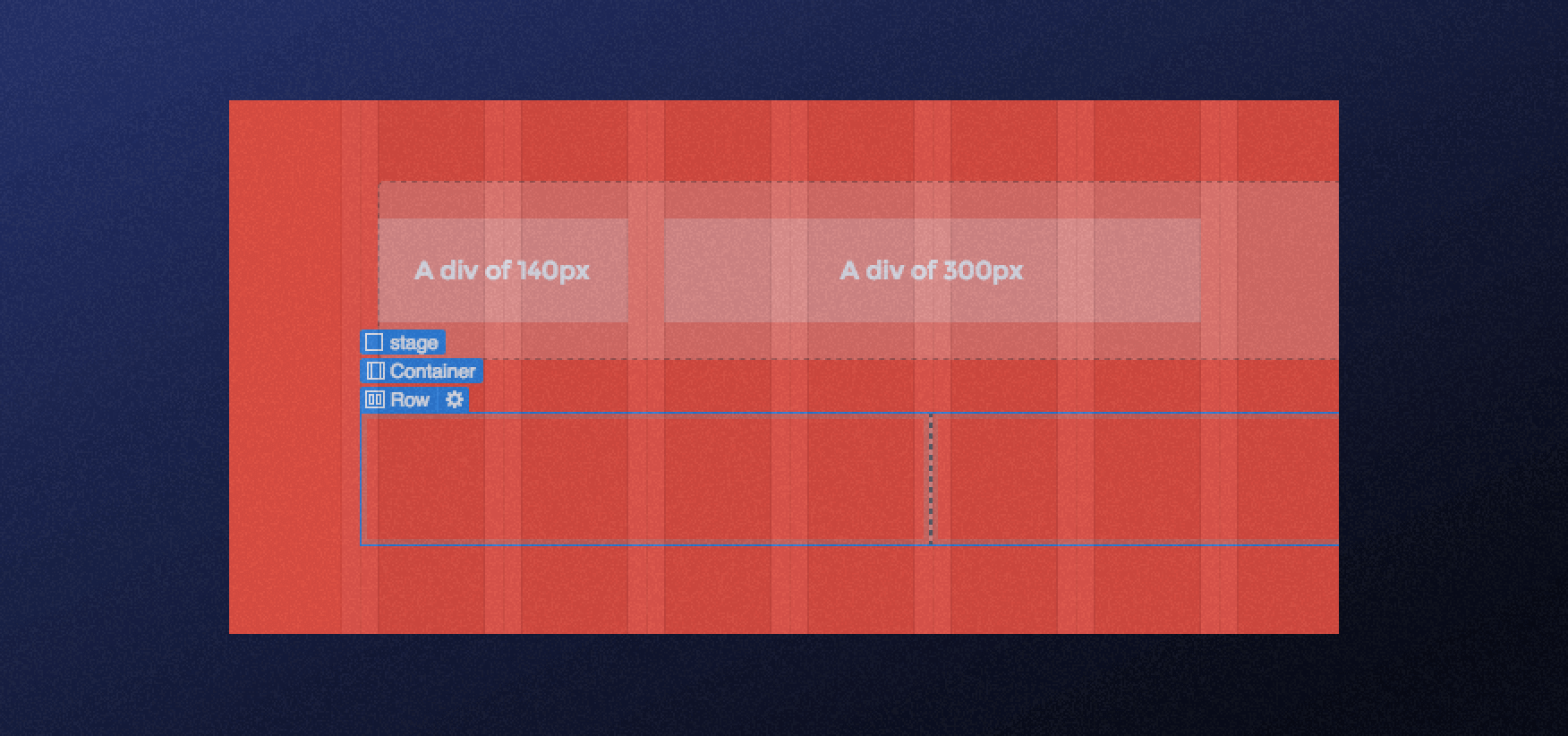
In Webflow, one common mistake some designers and developers make is using a "columns" element instead of a "div block" with a grid layout when structuring their website's layout.
While the "columns" element might seem like a quick solution, it can lead to various challenges that affect the overall design and responsiveness of the website.
The primary issue arises when you use a "columns" element and design it but later realize the need to customize the elements inside. This can become cumbersome and time-consuming because the "columns" element is not as flexible as a "div block" with a grid layout.
Additionally, the "columns" element can pose problems when it comes to responsiveness. As websites need to adapt to different screen sizes and devices, using a "columns" element might not offer the best solution for maintaining a consistent and visually appealing layout.
To overcome these challenges and ensure a smoother design process, using a "div block" with a grid layout in Webflow is advisable. The grid layout provides much more flexibility in customizing your design, as you can easily create multiple rows and columns.
6. Adding Margins or Padding to Child Elements
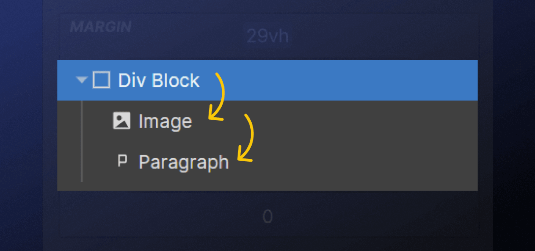
When designing a web page with Webflow, add some margins or padding to the elements on your page to create some space and improve the layout. However, you should refrain from directly adding margins or padding to child elements, as this can cause unwanted effects and mess up your design.
Instead, you should add these spaces to the parent element of these child elements. For example, if you have a section with a heading and a paragraph inside, you should add some padding to the section element, not the heading or the paragraph.
This way, you can control the spacing of the child elements relative to the parent element and ensure that they are aligned and consistent.
7. Adding Anchor Links with a Copy/Paste Method
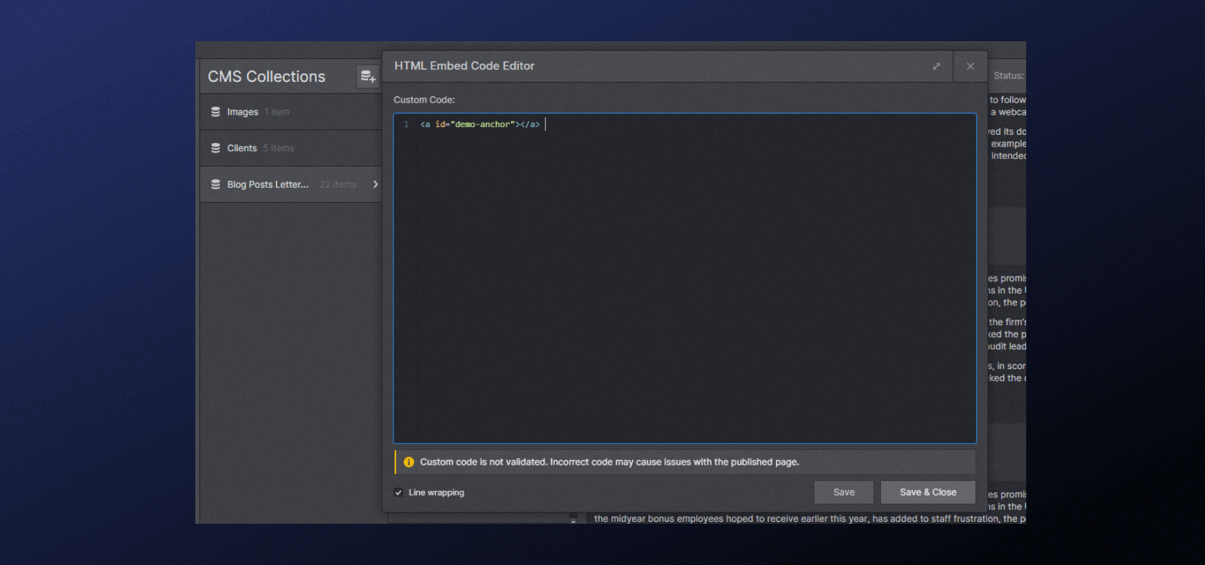
Adding anchor links to a specific section on a page is a common practice as it allows users to share direct links that bring viewers to relevant content without requiring them to scroll or search manually.
However, implementing anchor links in some website builders, like Webflow Designer, can be more challenging than a simple copy/paste action.
Webflow's native interface may not have a direct, user-friendly option to add anchor links within its visual editor. Instead, you often need to rely on custom code embeds to create anchor links, which might be intimidating or unfamiliar to non-technical users.
If you are unfamiliar with coding or have limited experience with custom code, it's best to consult with developers or someone experienced in Webflow. They can help ensure that the code embeds are implemented correctly and do not interfere with the existing website elements.
After adding anchor links, thoroughly test the webpage on various devices and browsers to check for any unexpected behavior. Ensure that the links take users to the correct sections smoothly.
8. Lack of Clarity on Who Did What

Webflow offers valuable collaborative features, yet there remains room for improvement in this area. While Workspaces are a step in the right direction, achieving full clarity on who did what requires additional streamlining from the Webflow team in the future.
Undoubtedly, Workspaces in Webflow have their merits, but they only partially eliminate the need to track changes made outside the platform. Keeping tabs on modifications becomes crucial to avoid inadvertently overwriting someone else's work or losing track of important updates.
Nonetheless, there is an opportunity to optimize your design and development process by incorporating the benefits of Workspaces effectively so that you can improve collaboration and ensure smoother project management.
For example, you can leverage the Page Branching feature, which allows several designers/devs to work on different pages of a single project at the same time.
9. Retrieving Edit History
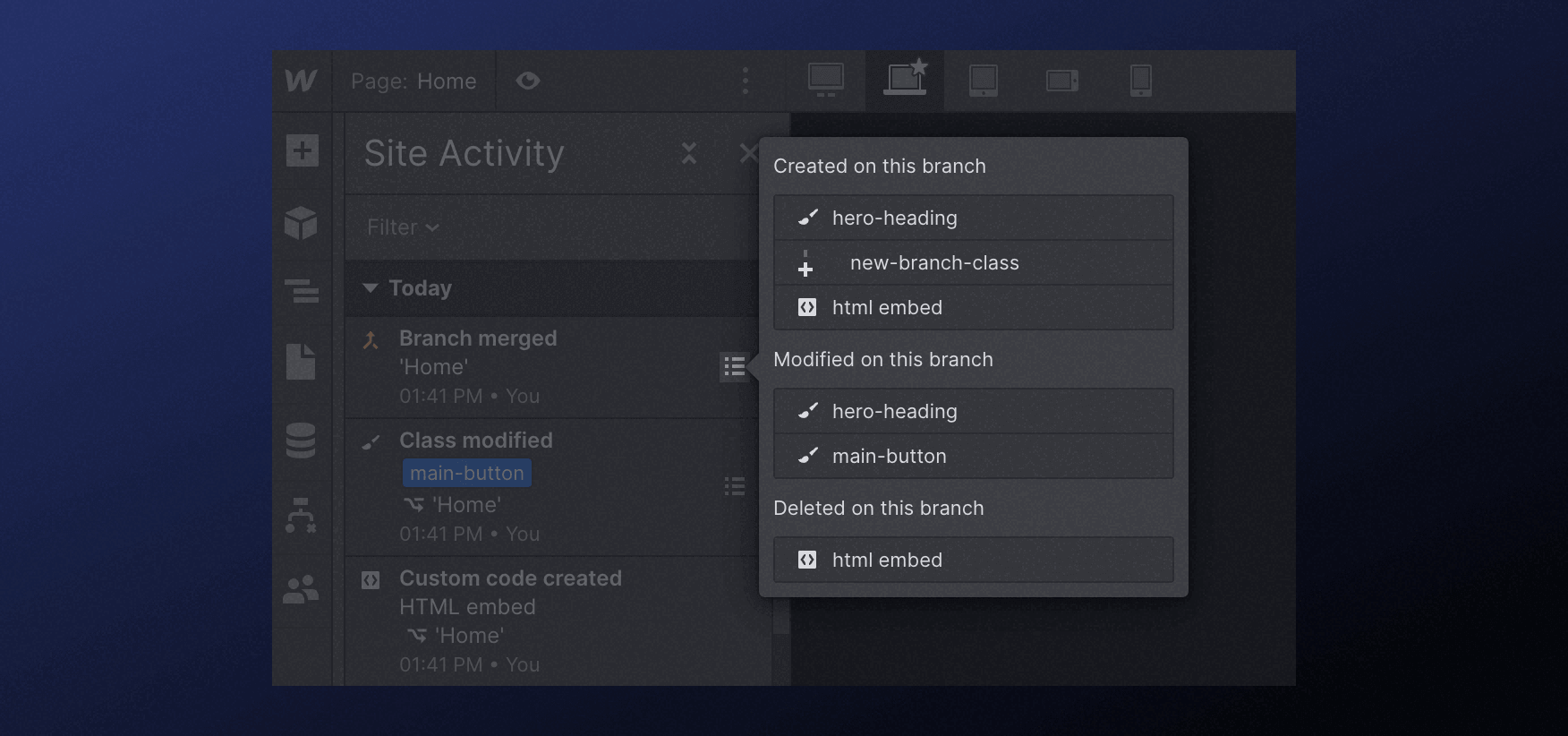
Unlike some other platforms or version control systems, Webflow does not offer a built-in, granular history of edits.
As a result, it becomes essential for users to be mindful of their edits and take additional steps to safeguard their progress. One way to do this is by manually saving versions of the project at significant milestones or before making substantial changes.
Third-party apps like Google Docs can be used to create documentation or snapshots of the project at different stages.
10. The Desktop/Tablet Issue

On larger screens like desktops, big menus may work perfectly fine as there is ample space to display all menu items without any overlap or truncation.
However, the challenge arises when the same menu is viewed on tablet devices or screens with lower resolutions. With limited horizontal space, big menus might not fit entirely, and some items may get cut off or hidden, leading to a poor user experience.
To address this issue, web designers and developers need to implement responsive design techniques to ensure that big menus adapt gracefully to different screen sizes. This involves utilizing media queries and CSS rules to restructure the menu and make it more suitable for smaller screens.
Some possible solutions include collapsing the menu into a hamburger icon that expands when clicked or reorganizing the menu items to prioritize essential navigation options.
You should also pay attention if you’re using a mega menu, as they require additional focus when adapting for smaller screens.
Make the Most of Your Webflow Site
Most issues you might encounter when working with Webflow Designer (or Webflow in general) are ongoing problems that occur regardless of the builder you select. On the other hand, it includes a range of capabilities that can benefit you if used correctly:
- Design freedom — Create stunning websites without coding expertise using Webflow's intuitive visual interface.
- Responsive by default — Webflow ensures seamless user experiences across devices with built-in responsive design.
- Interactions & animations — Engage visitors with captivating dynamic elements using Webflow's powerful tools.
- E-commerce capabilities — Webflow offers flexible e-commerce features for businesses of all sizes.
- SEO optimization — Boost site visibility with Webflow's essential SEO tools.
- Hosting & security — Webflow provides reliable hosting and robust security.
- Webflow CMS — Effortlessly manage content and updates with Webflow's user-friendly CMS.
- Community & support — Join a helpful community and access reliable customer support in Webflow.
Therefore, Webflow remains one of the most potent tools for building robust and business-driven solutions, as long as you have a team of experts to help you utilize most of it.
Make sure to get in touch with the Flow Ninja team if you need a reliable Webflow partner.
{{cta}}
FAQ for Common Webflow Problems
How does Webflow compare with WordPress for SEO performance?
Webflow offers built-in SEO tools like clean HTML5 markup, customizable meta tags, and automatic sitemap generation. WordPress relies more on third-party plugins. For users prioritizing visual design with native SEO capabilities, Webflow may provide a faster, more integrated experience.
What’s the best way to back up your Webflow project regularly?
Use Webflow’s built-in version history to manually create backups before making significant changes. For additional security, export your project’s code periodically or document milestones using third-party tools like Notion or Google Drive to maintain visual references and notes.
Can you integrate Webflow with third-party analytics tools?
Webflow supports integration with tools like Google Analytics, Facebook Pixel, and Hotjar through custom code embeds or via the Project Settings. These tools help monitor user behavior, conversion tracking, and optimize site performance effectively.
Is Webflow suitable for building multilingual websites?
Webflow doesn’t natively support multilingual functionality, but you can integrate third-party services like Weglot or Localize. These platforms enable dynamic language switching and translation management without compromising user experience or SEO effectiveness.
What are the best practices for maintaining responsive design in Webflow?
Design for mobile-first, use relative units like percentages or ems, and regularly test across breakpoints. Employ Webflow’s Flexbox and Grid tools for layout control, and avoid fixed heights or widths that may conflict with content on smaller screens.
How can Webflow's CMS help non-developers manage website content?
Webflow CMS allows non-technical users to manage dynamic content through an intuitive interface. Editors can update blogs, team pages, or portfolios without touching design elements, ensuring separation of content and layout for safer updates.
What options exist for e-commerce functionality in Webflow?
Webflow offers built-in e-commerce features including cart systems, product pages, and checkout integrations. For advanced functionality like subscriptions or multi-currency, users can integrate third-party solutions such as Foxy or Shopify embeds.


.svg)

%2520(1).png)


![Webflow Review: An Expert Deep-Dive [2025]](https://cdn.prod.website-files.com/65eae076071dff04d3670886/660aa2a0f59271e8c9157ada_65b372f857cf0ee336ea34a5_1080%2520x%25201080-min.png)
![Webflow Review: An Expert Deep-Dive [2025]](https://cdn.prod.website-files.com/65eae076071dff04d3670886/660aa2a0f59271e8c9157ad4_65b3730220c9b0c68f4c4a83_1200%2520x%2520630-min.png)

.webp)

.png)

-min.png)


.svg)

.png)
.png)
.webp)
.svg)

